CSS Filter Generator
Stack blur, brightness, contrast, saturate, hue, grayscale, sepia, invert, opacity, and drop-shadow with live before/after preview and IDE-ready CSS.
Workspace
CSS Filter Generator
Stack blur, color, and drop-shadow filters on any element.
Live
Presets
Filters
Drop shadow
Optional drop-shadow layers on the filtered element.
Preview & output
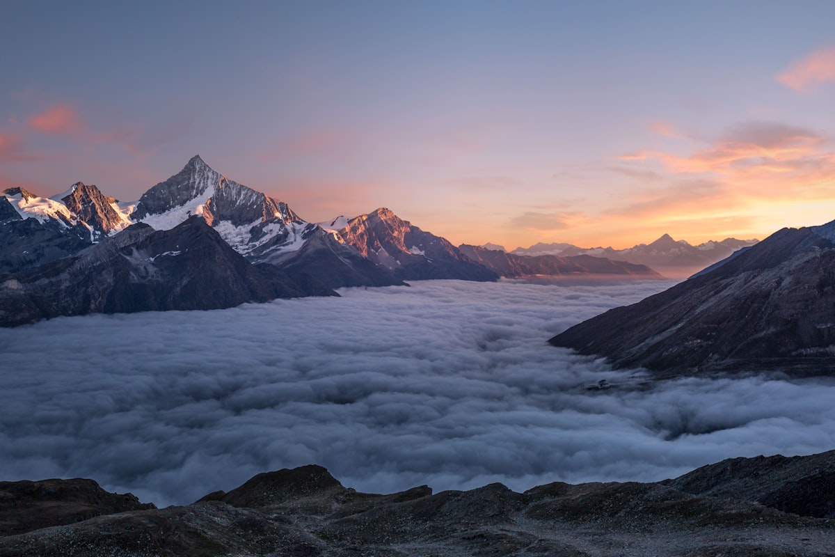
Preview
Live filter
contrast(110%) saturate(140%)
Copy · Download
CSS outputcss | filter.css
.filtered {
-webkit-filter: contrast(110%) saturate(140%);
filter: contrast(110%) saturate(140%);
}103 characters | 4 linesIDE view - syntax highlighted
Keep exploring
Related tools
CSS Tools
Backdrop Filter Generator
Design frosted-glass CSS with live backdrop-filter preview, presets, borders, drop-shadows, and IDE-ready CSS output including -webkit prefix.
Open toolImage Tools
Image Adjustments
Blur, brightness, contrast, saturate, and grayscale with before/after compare — process locally.
Open toolAnswers
Frequently Asked Questions
Click a question to open it. Click again to close.
Looking for more? Browse Our Tools.